Tactile Maps
A German translation of this blog post is available.
Quick disclaimer: It’s been ages since I last wrote a blog post. The wording’s a bit rough in places, but I just wanted to finally get this piece out there.
We need to talk about tactile maps.

I designed and built a tactile map. Here I would like to describe how to design and manufacture something like this.
This is actually part of the Unifest blog post (which I will link to here as soon as I finally finish it). However, I have separated the tactile map part so that I can write a more detailed introduction and thoughts. These have nothing to do with Unifest and would otherwise seem somewhat out of place there.
Tactile maps are physical objects made for a static purpose.1 These maps can be portable on paper, like a flyer you can put in your pocket. But they can also be stationary, which is the category I am focusing on here.
Tactile city models
Placing a stationary object that can be touched in a public space can be very eye-catching. This gives it a different status than, for example, sober information on a website or a map on a smartphone.
In Germany, one example of this are the bronze city models by Egbert and Felix Broerken. On their website, they currently list 216 locations of their city models.
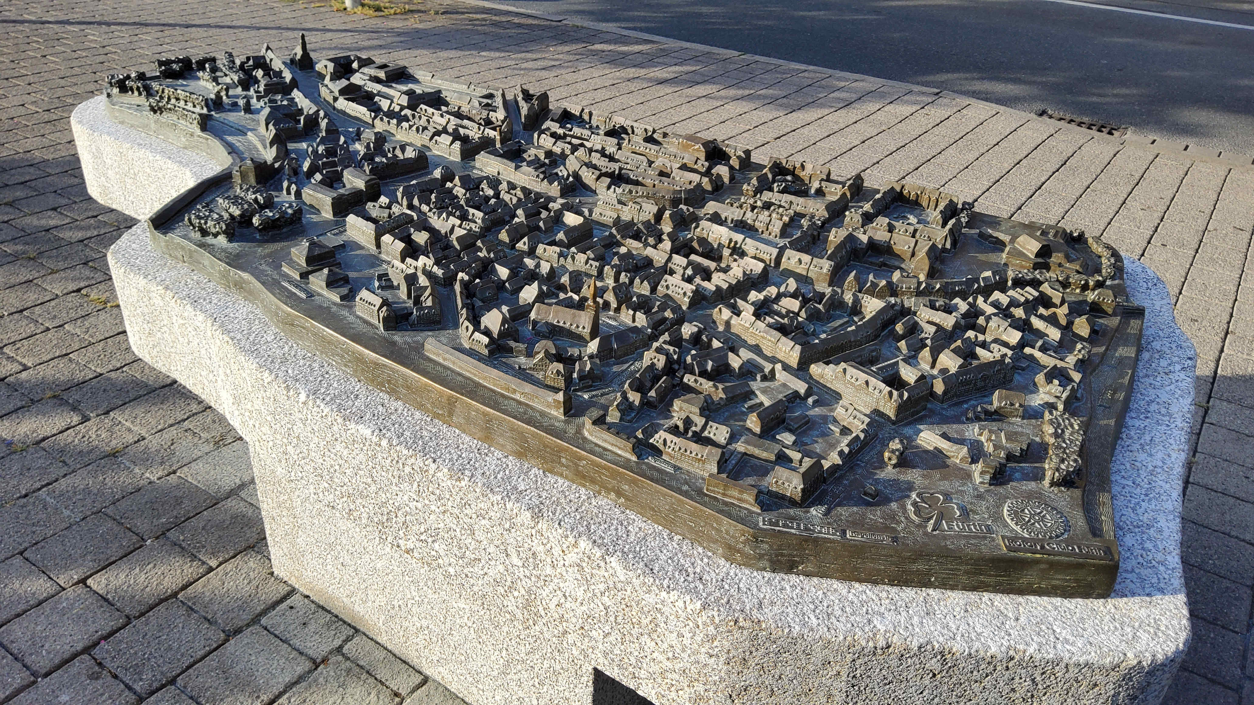 City model in Fürth, license: cc-by-sa-3.0 Author: ‘Chrischmi’ from FürthWiki
Now … Have you ever seen one of these?
City models like these appear less like formal escape plans and more like art objects2 due to their creative freedom.
They are one-of-a-kind pieces that take time to produce, and we display them in central locations. We like to put them in front of city halls.
When I think about the first time I saw a city map like this, I’m pretty sure I stood in front of one as a child in a group. Objects that children can touch are naturally of great interest to them. And when you’re always told as a child that you shouldn’t do that with objects in public spaces, an opportunity like this is gratefully accepted.
What is not limited to children is that these models are also well suited as meeting points for group tours. People can gather around them and use the model of the city as a tool for presenting information. The group can collaborate, for example, by having someone ask a question and highlight individual points or areas with gestures. This tool also makes information accessible to sighted people that would otherwise not be available to them. They may be able to visually grasp the dimensions and relationships in their field of vision around them, but not those of an entire urban area. And unlike the map on a smartphone, it is also three-dimensional.
Such a city model offers added value for potentially all sighted people. At the same time, when standing in front of it, they notice the Braille writing. We have enough general knowledge to conclude that this is something “for blind people”. With this knowledge, it is not far-fetched to associate the tactile with an alternative to the visual perception of the city for understanding the buildings.
Every now and then, a group in a city proposes such a tactile city model. Other municipalities have already done this before, we think accessibility is a good thing, and quite often a monetary donor can be found. So we set up tactile city maps with some sort of routine.
If “bronze site plan” = “good for accessibility,” then we know what we need for Unifest.
One small difficulty: the city map in the picture above weighs 150 kilograms for the bronze part plus 1.5 tons for the granite base. I fear that this characteristic will cause some skepticism in our festival logistics department.
The most widespread type of tactile maps (in Germany) is also one of the most complex and expensive to produce. That is somewhat remarkable.
So we require a different approach. The maps that are useful for sighted people in everyday life (whether they are generic designed navigation apps or public maps in subway stations) are usually more understated and not as spectacular as the bold bronze object in the town square.
So let’s look for such ‘boring’ implementations.
Stationary tactile maps for everyday use
I found a few outside Germany and took some photos. Let’s unpack a few of them.
We’ll start with a tactile map from Bath in England of an old Roman bath, which is now a museum.
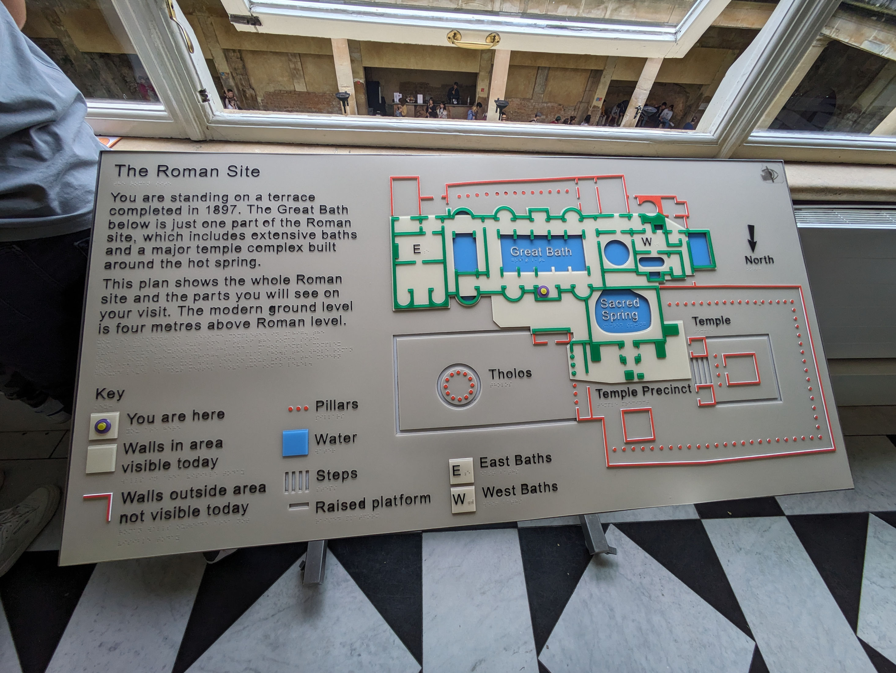
Similar to our city models, this map is based on the idea of universal design. In this case: the presentation of information is universally accessible to both sighted and blind people. Nevertheless, a sighted person would hardly design a map for another sighted person in this way.
The bronze city models, on the other hand?
If you were to ignore accessibility for blind people, it might have no effect on the way such a public model is designed.
And despite the design: the people I visited the museum with at the time did not notice that this map was intended in any way as an accessibility feature. It was positioned centrally at the end of the entrance passage. There was no “normal” overview map that it was supposed to supplement, and there was no explicit sign that highlighted these features in any way. When you go about your daily life (and haven’t just read a blog post about it), it seems to be enough to ignore the larger font, that it is tactile, and the existence of the transparent Braille, so much so that you don’t notice anything.
An extreme example of “also for sighted people” is a map I found in Slunj, Croatia:
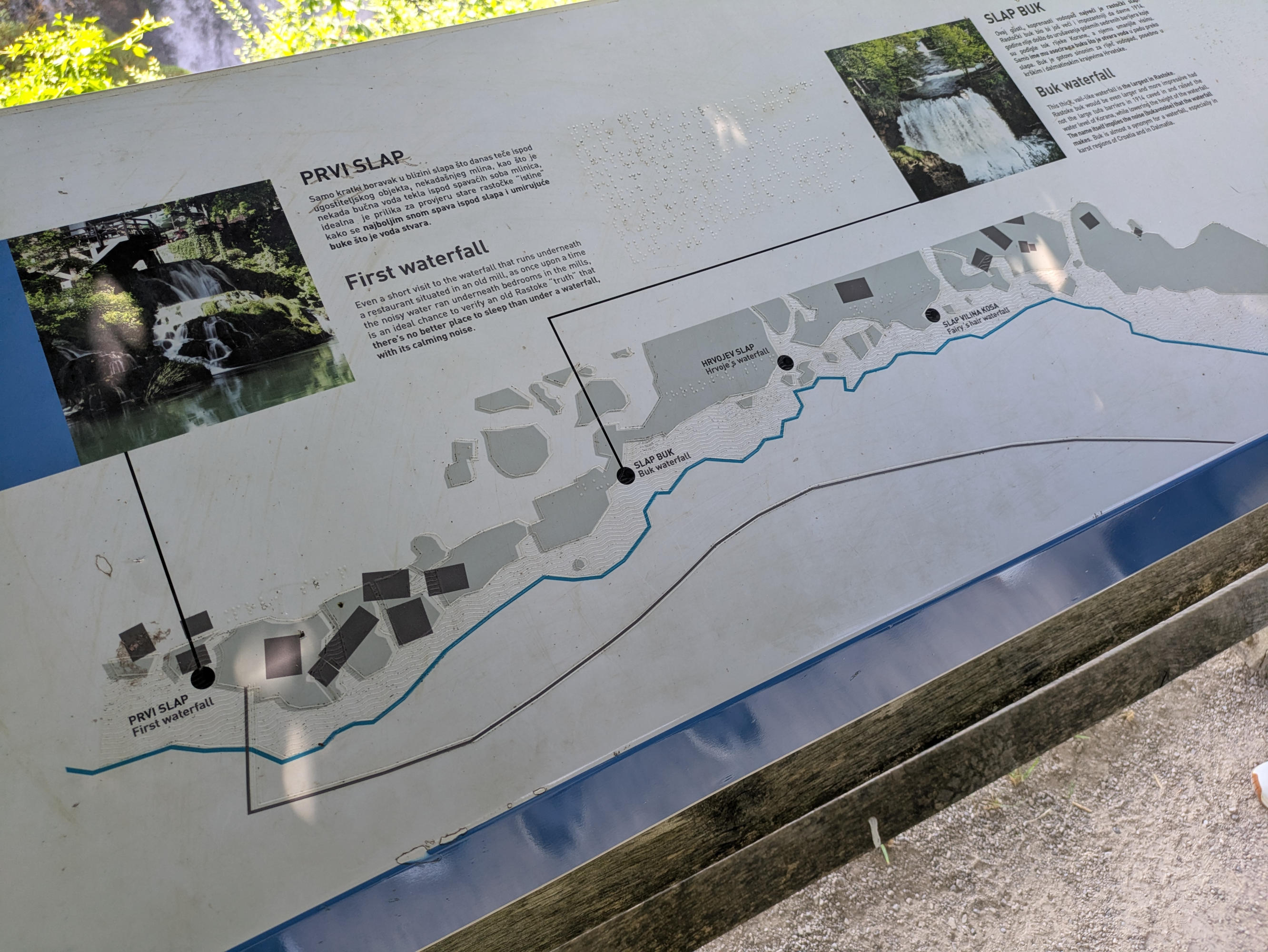
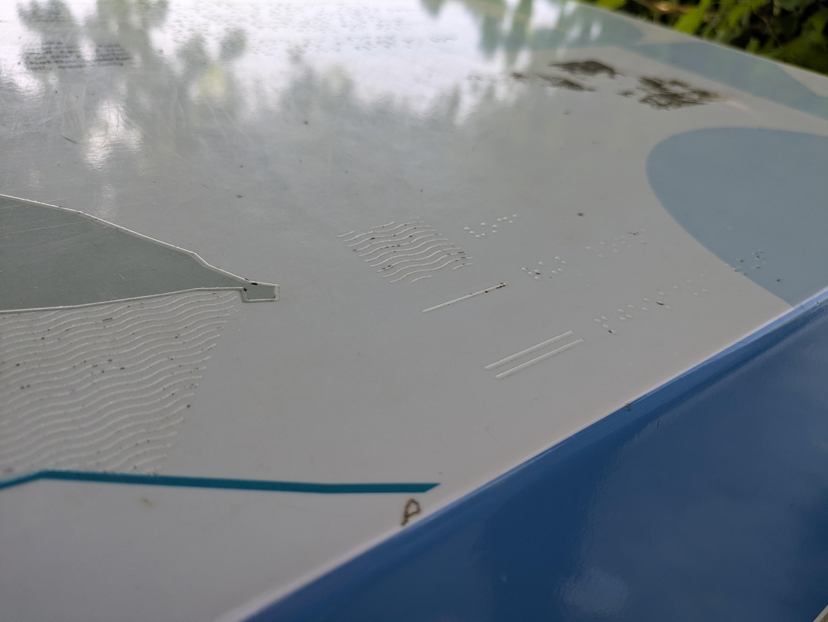
The tactile presentation hardly influences the visual presentation. Among other things, the typeface is not particularly large. The print itself is not raised. The only tactile lettering is Braille.
Approximately 10–20% of blind Germans (the figure is similar in the US) can read Braille. This number varies depending on which subgroup you look at. Blind KIT students can usually read Braille. Some can read long texts fluently, while others may only be able to read individual words more slowly. Such a stark divide between the presentation of information for sighted people and (possibly flawed ideas about) for blind people is often not really that useful. This applies not only from the perspective of how information is presented to blind or visually impaired people. The close-up of the tactile legend illustrates this nicely. When viewed head-on, it is not easy to recognize it visually. When someone touches the map, they have to locate the legend. However, this makes collaboration with a sighted person much more difficult. In general, I find it unnecessary and weird when you are standing next to each other in front of an object but can only talk about it to a limited extent because you have two separate views and don’t know what the other person is perceiving.
These two implementations of a tactile map alone show how differently such maps can be designed. Even in the case of more schematic or abstract representations, each map is the product of a new creative process.
This can be guided by:
- It depends on what you actually want to present. Which is no different in the sighted world. A subway network map looks different from an information board showing how to get through a construction site.
- What is my self-image in my assumptions about how my target group perceives the map? Do I make a strict distinction between “has full vision” and “is blind, can read Braille perfectly”? What about people with visual impairments who, despite limited vision, can still comprehend plans more efficiently visually than in a tactile format?
- And finally, in the more technical implementation. How do I position a map legend? Which symbols do I use? Do I work with textures? ….
Looking it up in the manual
There is DIN 32989 for the barrier-free design of tactile maps. It contains something (really only slightly) taken out of context:
It is recommended […] to involve local self-help groups for blind and visually impaired people.
Holy shit. A DIN standard that doesn’t say that everything that doesn’t come from it is Sodom and Gomorrah.
The relevant standards can certainly be taken into account and used as a starting point. Colloquially put, you end up with a design that is less artsy and more like signs in elevators and subway stations. Both are perfectly fine.
I find the design from Bath quite appropriate, and the standard only takes you so far, depending on what you want to represent or where it hits its limits, as quoted. But you can pick out a few ready-made building blocks. This way you don’t start from scratch, but you have to put them together meaningfully. Instead of traveling the world and building up a catalog of examples, you can also find inspiration in scientific publications (Google Scholar).
It’s nice when you find things like the ATMaps project from the EU, which your own university was heavily involved in at the time. It contains a catalog of symbols that were evaluated by 120 people in four EU countries to ensure that they are tactilely distinguishable from one another. These symbols are grouped as areal, lines (e.g., for walls), and points (entrance, toilet, etc.). The project also makes suggestions as to which symbol to use for what and which elements are important.
But this is where it gets tricky again. Research results may have been produced in a context that differs from your own. Perhaps you are offering your site plan in a place where users are accustomed to an existing standard. In that case, it makes sense to follow that standard. I don’t necessarily mean this in a restrictive way. Work on site plans by ACCESS@KIT, for example, is based in part on reusing existing plans, such as escape plans, and doing so automatically. To do this, the symbols must remain small enough. However, I have space and can think about what to include or leave out and don’t have to decide this automatically.
Everything summed up: a very free design process. There are a few building blocks. However, these must be adapted to your local project.
We take three pieces from this for our Unifest plan:
-
The plan exists for blind and visually impaired people and is designed tailored towards them. However, it should also be accessible to sighted people.
-
Publications / guidelines, especially regarding symbols, which may need to be adapted slightly.
-
The examples from the field and the criticism of the plan in Slunj. In particular, the rigid assumptions about how users use the plan and their abilities.
Tactile Map at Kaufland / Schwarz Group
Before we start designing the site plan for Unifest, here is a third (and final) example of an existing tactile map. This time from Kaufland, aka the Schwarz Group. They are based here in Heilbronn, Germany, but the plan for this Kaufland was in Dubrovnik, Croatia.
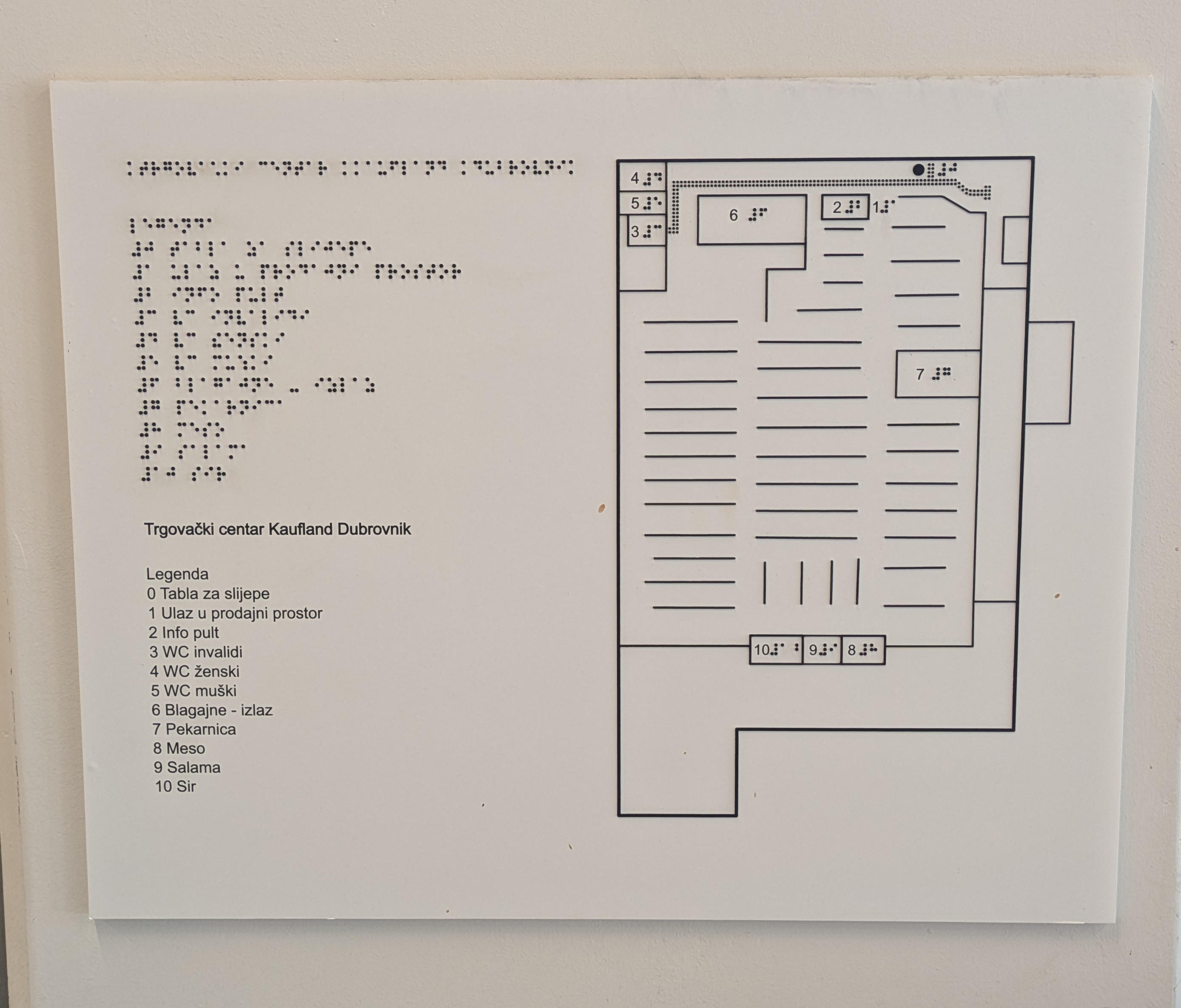
Compared to the plan in Slunj, this one from Kaufland clearly conveys that it exists for the purpose of improving orientation for blind customers. All features and the selection of information conveyed are not influenced by the desire to provide added value to sighted customers. Nevertheless, all tactile features, including the Braille dots, are visually black, and Braille is also displayed in print. This makes the aforementioned collaboration with a sighted companion possible in both directions.
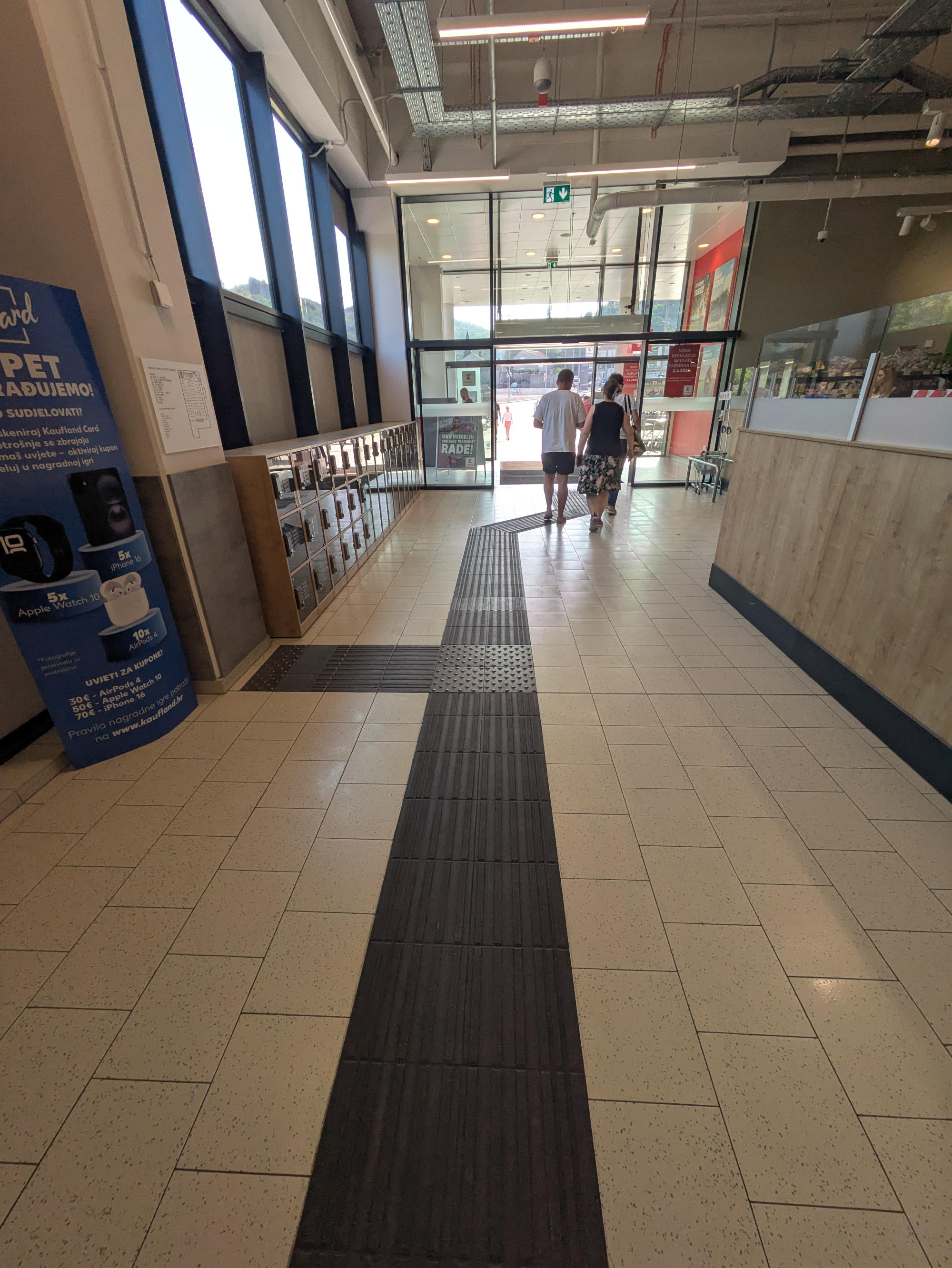
Then there is the choice of symbols. This plan manages to combine symbols for a representation that hardly requires the learning of a specific concept. The solid line as an impassable element is one of the most universal in its meaning and, together with the building outline and the shelves, provides a solid basic structure that is self-explanatory. A dot symbol is used for the plan and location itself. This can also be deduced from the basic structure and the knowledge that you are standing in front of this very plan. It is also quite common to use a dotted line in some form for tactile floor guidance systems. Here, it is the only other line symbol apart from solid walls, and you can recognize the route from the entrance to the attention field in front of the plan you are standing on.
Simply numbering all points of interest with Braille is also an interesting compromise. There is no need to learn a catalog of symbols and their meanings. This also eliminates the need for a legend. Only the number is marked on the map itself. Even if I can’t read Braille (or with less proficiency), I can utilize the numbers as tactile symbols.
The map does not have raised lettering, but at least a sighted companion can tell you the meaning of the numbers, and you can then locate them yourself on the map. The companion could also be a phone and a multimodal LLM.3
On the one hand, the legend has remained compact, but on the other hand, this does not work for everyone. Ultimately, the inclusion of large and/or raised lettering is a somewhat annoying conflict between advantages and disadvantages.
All in all, however, I consider this to be an implementation whose features I find appealing in many aspects.4
Design (Now for real)
Cool Cool Cool, now one can do it oneself.
As a basis, we set ourselves a few characteristics that I want to fulfill and restrictions that we are subject to.
We are creating a design with which we will produce two map. In the end, it will be used at Unifest, a student music festival with 14,000 visitors over two days. The site does not have a tactile guidance system (except for one small instance). There is a supplementary or alternative textual description of the site available on a website. Our plan, however, is stationary and was positioned once at the entrance and a second time in the middle of the site next to the awareness stand there.
The design should be based on the principle that blind and visually impaired people can use the map. Sighted people should have access to the same information. However, this should not be achieved by presenting information differently, but by ensuring that the tactile elements can be visually perceived.
All representations are binary; we only use white and black. This is linked to whether something is raised or not, thus ensuring the connection between tactile and visual elements. This two-color scheme is also important to keep production simple.
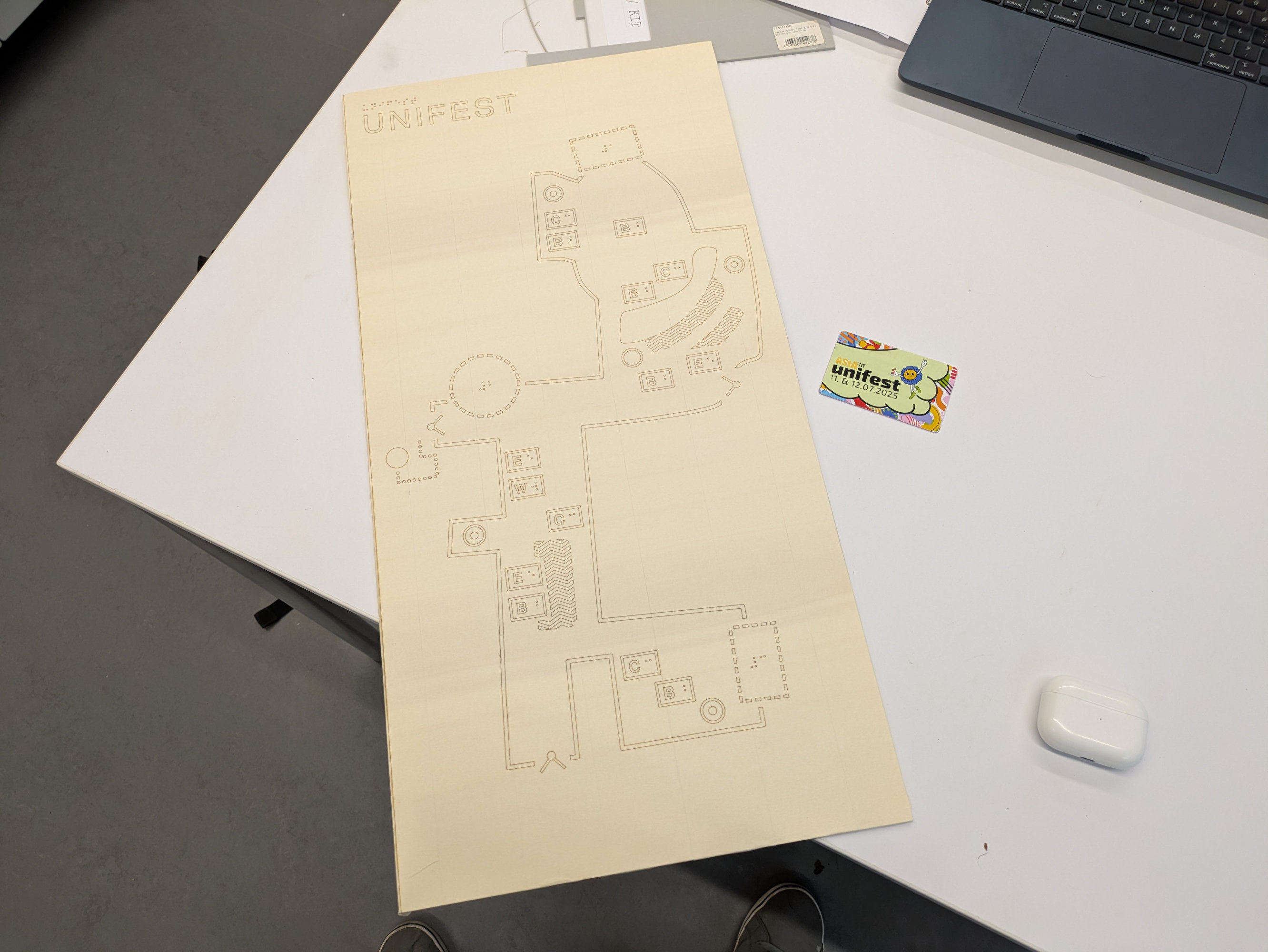
The visual guest map is printed on fence banners, for example, but also distributed via social media channels, serves as the basis. Before I talk about the details, here is the visual map and the final tactile design:
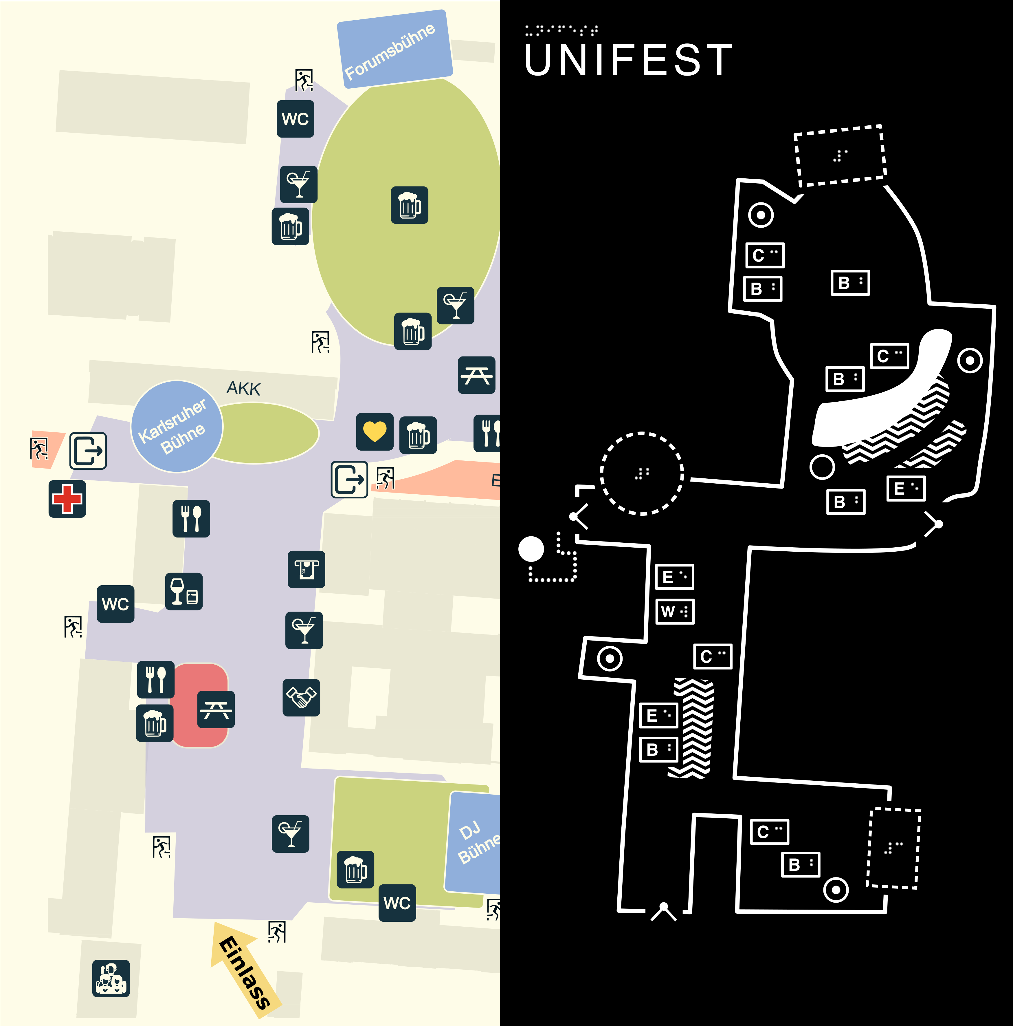 On the left is the existing visual only map for visitors. On the right is the tactile map (without the legend). The visual version does not specify the size at which it is to be displayed. The tactile map is designed to be 30 by 60 cm in size. The (not shown) legend, measuring 60 x 60 cm, is attached to the right-hand side.
Symbols
First, we need to be specific about what we actually want to convey. On the one hand, we can focus on the characteristics of the environment and convey these. For example, the city map with its detailed buildings. The map from the museum is more abstract or schematic, but it still allows visitors to experience the shaped walls, columns, size of the individual areas in relation to each other, and basins, more precisely than a text description could. Or the map at the Kaufland, where the focus is less on examining the exact size ratios and more on providing information about where points of interest (POIs) are located and the surrounding area, which can serve as a reference.
The initial purpose of the Unifest plan was more the latter. But: There was also a textual description available. The tactile map was intended to offer added value beyond simply naming and locating POIs. Therefore, embedding the POIs in the outline should also allow the textual description to “straighten out” any preconceived notions. In addition, this made it possible to convey how the stages relate to the visitor area, the effect of their size, and how they impact the area.5 I wanted to incorporate this aspect of their arrangement.
There are three types of symbols for display at the end. Solid lines, areal, and point symbols. For the latter in particular, you now have to decide what you want to include on your map. If you are reading this and are unsure yourself, the ATMaps project can help us here too. It provides us with a ranking of POIs by importance.
From ✨literature✨ on the number of symbols, we know that we should end up with 10–15 different symbols. However, these are grouped into 6 dots, 3–4 lines, and 3–4 area patterns. So you can take the table there and filter out obviously irrelevant POIs and take what is left from the top. But: This table only gives a rough impression and does not provide a reliable distinction between the listed elements. Even if 115 blind participants are a statement, the publication does not say anything about how transferable the results are. The necessary data to apply the appropriate statistical tests oneself is also not present. That’s okay, but perhaps one should not cling desperately to a ranking because it has numbers with three decimal places when there are other aspects to consider in the decision.
It’s always worth looking at local practices when choosing and assigning symbols. If there are still uncertainties, existing local maps are not consistent, or are rarely used, use the symbol assignments from the ATMaps project. This is the most comprehensive standard that is suitable for many applications. If you can’t come up with anything better yourself, at least you’ll be in line with others.
The more symbols there are, the more meanings you have to remember and the more distinguishable all symbols must be. When designing, you have to be aware that the perspective of “I think long and hard about how the map makes sense” creates a different impression than for the person who is confronted with the chosen assignments for the first time when they want to use the map. And even if you have designed a map in a participatory manner, it is helpful to give a copy (or prototype) to someone and see how well the map can be understood without preparation.
For my Unifest map, I have grouped the POIs into three categories.
- The stages have a dashed border. This category has the most individual design.
- Food and drinks are small rectangles and use a presentation similar to “numbers on the map.”
- The rest of the infrastructure uses abstract symbols. Established symbols are used here.
Infrastructure
![]()
The following infrastructure is included on the map:
- Entrances and exits
- The awareness stand (aka service point)
- The medical service and, at the same time, the location of a DIN toilet
- Toilets
These POIs are the least event-specific. That is why established symbols are used here.
If you are lucky, a user will not have to learn them from a legend, but will already be familiar with them. The EU ATMaps project also offers suggestions, not only for easily recognizable symbols, but also for assigning meanings to them. Just one small hicup. ATMaps toilets are represented by filled circles, while I have chosen a ring with a dot in the middle. The latter are elevators in ATMaps. Smart readers may now be wondering:
Huh? Is he stupid?
I hope not. Didn’t our university participate in ATMaps? Yes, but in other later publications, which involved less non-local stakeholders, different guidelines for symbols in indoor maps were developed. These go by ATIM (Accessible Tactile Indoor Map). The ATIM set uses the symbols from ATMaps, but some of them have a different meaning. This is where the assignments of my four infrastructure symbols come from.
Food and beverages
![]()
The following are included for food and drinks:
- Wine / Whiskey
- Food (German “essen”)
- Beer
- Cocktails
The Unifest offered a wide variety of food options from rented food trucks and booths. Given their number and the length of their names, I didn’t see how I could sensibly include them in the map. Therefore, they were grouped together under “essen”.
However, the variety of food on offer is an interesting piece of information. Visitors with sight can visually scan this information as they walk around during their visit. The exact listing and positioning was therefore included in a textual description of the site, which was published on the website, and a reference to it was later added to the tactile map.
One could now use abstract symbols for these four elements. However, these would not follow any established standard. Everyone interacting with the map would have to go through the legend and memorize it in order to then go through the actual map. Instead, these symbols’ design borrows from the Kaufland map. You do have to learn a meaning, but this does not have to be assigned to arbitrary shapes, but rather to a more abstract concept, such as a number. In the map itself, you then only have to recognize the number.
Instead of numbers, I used the first letter of the (German) name, as these are all different. However, I had space problems with my initial design.
I wanted to avoid Braille, as the map was also intended for visitors who can work with high contrast and low detailed visual elements. Instead of Braille, I used a rectangle with a letter in print in the middle. This letter then became the tactile icon, so to speak. Sharing the same angular outer shape as a border, all the “Food and Beverages” POIs should be easy to explore and distinguish from other categories on the map.
Testing these tactile symbols in isolation worked quite well, but if the person has no difficulty with Braille, it doesn’t take long before you get asked why you didn’t just put the letters in Braille there. So now we have created a wonderful conflict of interest. I didn’t have a clear basis for weighing up the decision, but one was an abstract argument, while the other was a concrete request that had been voiced several times.
The print letter was reduced in size, but with thicker lines to maintain visual legibility. This diminished the possibility of tactilely feeling the print letter. In return, the print letter now also fits into the box alongside the Braille letter without making it too large. This is an acceptable compromise. Nevertheless, I’m somewhat dissatisfied that I didn’t present “visually high contrast,” “tactile Braille,” and “tactile no Braille” together as unified perception modalities.
Stages
![]()
The three stages should have similar symbols on one side (they are all stages, after all), but on the other hand, they must be distinguishable. For distinguishability, they were numbered 1 to 3. This was then placed in the middle of the symbol. The question remains as to what else should be included in the representation besides the Braille symbol itself.
When I was thinking about the stages, I noticed at some point that two stages were angular and one was round.6 The angular stages were aligned once vertically and once horizontally on the north-oriented map. This resulted in the dashed line, in these three shapes.
The stages are positioned on the edges of the festival boundary, so that you move from the solid line of the boundary to the dashed line of the stage symbol. Unlike the other POI symbols, the stage symbols actually correspond to the shape and size of the real stage (to scale :D).
Somehow, I like that line elements always represent actual geometries. I also like that it conveys the relationship between the stage structure and the visitor area in front of it, and how the stage appears in terms of size when viewed from there. But that may just be my personal aesthetic preference.
Areal
There are two separate areal symbols.
In the middle of the site, there is a small strip of hill covered with dense vegetation, which is not accessible to any guests. Instead of drawing its contour as a boundary line, it is a continuous area. This is fairly well established.
The second areal symbol is for seating.
Beer table sets have been set up in some areas. In one place, it is relatively simple and rectangular. The other area, however, follows a curve and is separated by a path that people can walk along. Modeling this as an area also allows dimensions and shape to be conveyed more effectively in relation to the rest of the site than through a textual description alone.
This leaves the question of how to make the area recognizable. Here, too, we look in the ATMaps symbol catalog and simply take the next pattern after “filled area.” These were the angular waves.
Legend
I find the legend a bit ‘meh’.
The obvious: it takes up two thirds of the plan.
Two further points of criticism:
-
Those who are proficient in Braille could have a much more compact display and would not have to scan large areas and ignore raised lettering that is irrelevant to them.
-
Gestalt has struck again. Symbols, Braille, and raised lettering are aligned with each other, and each legend entry is aligned with other entries. Unfortunately, this was done from a “sighted” perspective. The stages are aligned with their upper edge at the upper edge of the Braille legend text. When testing, however, the symbol was not initially associated with the legend entry because the Braille label within the stage symbol served as a reference point and was itself offset.
That’s all I want to say about the legend. It needs another try.
Manufacturing
There are various manufacturing options, depending on the materials and equipment available.
- With an embroidery machine on fabric
- With a 3D printer
- With a CNC milling machine
- With a laser engraver
With the 3D printer, I would have had to produce a bunch of small plates. However, I also had access to an Epilog laser with a 30 by 60 cm working area, so I decided to use that. These are all valid options. If you don’t have access to any of these devices, you may be able to find support at a local repair café or hackerspace.
At first, I was thinking of using thin plastic plates. These are available with two layers of color. When the machine removes material, the result is not only tactile, but also two-toned. Alternatively, you can use transparent acrylic and polish it after removal so that everything is clear again. Behind the plate itself, you then add a visual layer (printer, pencil, wax crayon, etc.).
I wanted to go with the two-tone plastic panels, but unfortunately I ordered the wrong material. So I went to the local hardware store and bought some wooden panels. In the past, I had used MDF panels. However, the wood glue from the MDF mixture is a bit messy and needs post-processing. Quite a lot of material has to be removed for the tactile map (we are removing a large area so that individual elements remain raised). That’s why I chose poplar wood. It was the softest (and cheapest) type of wood I could find there. Solid wood carries the risk of having different densities and, after removing a large area, not being uniform. But that went reasonably well in the end.
I’m a computer scientist and know more about digital accessibility than the production of hardware solutions. So, at this point, I’d like to thank my ‘Gesammtschule’ for the uhm… ‘crafting’ courses. A first attempt then delivers this result:
This can then be used to determine the laser settings or to make adjustments to the input file so that elements with gradients in particular come out as desired. This sample also uses the old design of individual raised letters as tactile symbols on the map. In addition to fine-tuning parameters for production, this sample can be used to gather change requests, as happened here when switching to the print-and-Braille letter combination.
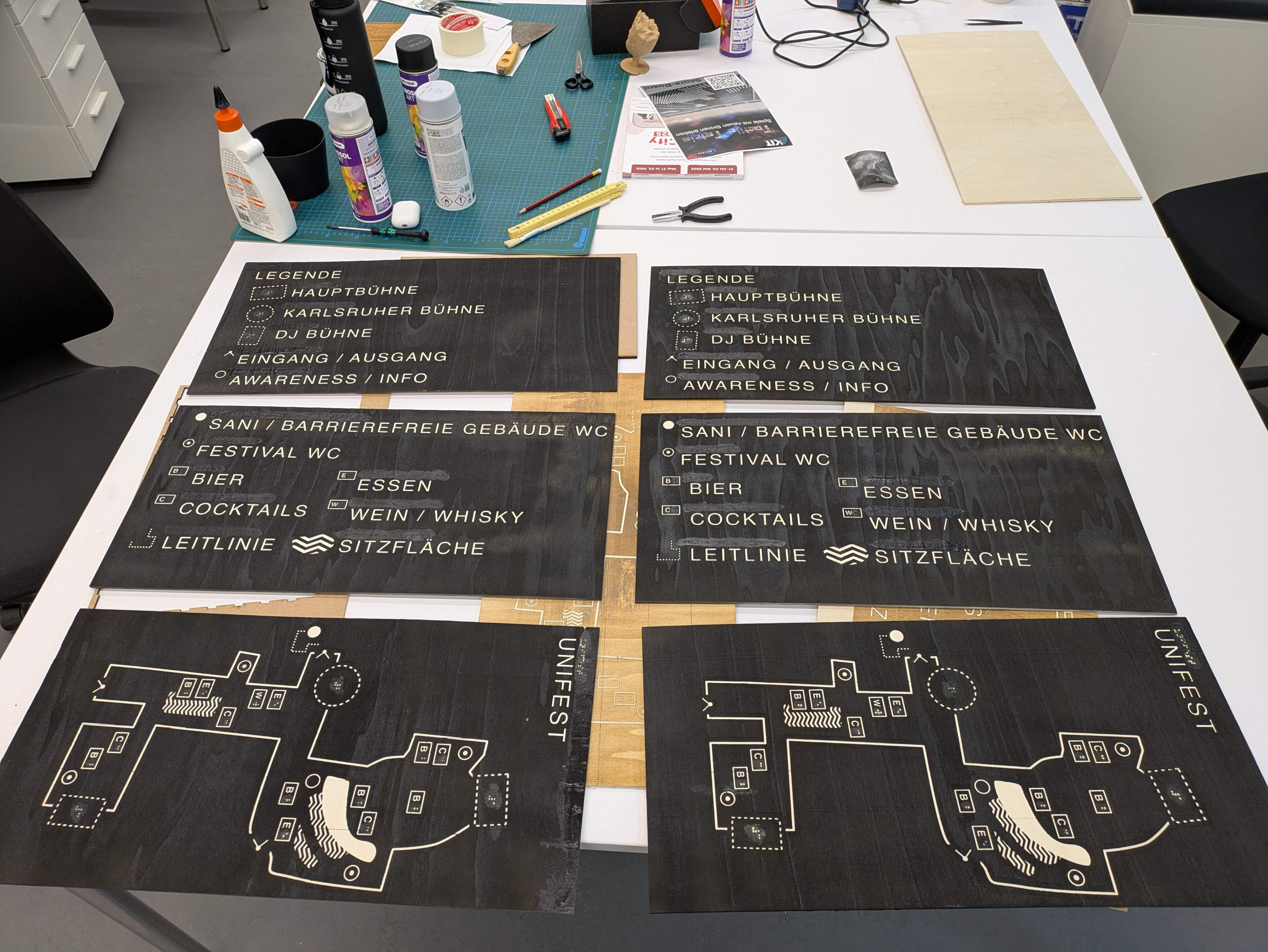
After some trial and error, I started my small production run. I wanted to make two maps, each consisting of three 30 by 60 cm panels. The steps were as follows:
The entire panel is masked with masking tape and placed in the laser. The laser then cuts the contours once. The panel is then removed.
The large areas are peeled off and the piece is placed back in the machine to remove the surface. Paint the result black and go crazy while peeling off the remaining masking tape with tweezers.
One might notice some discoloration, especially where Braille dots should be. At some point, I realized that the Braille text for some quite different words looked quite the same.
Oops.
In addition, I had changed the settings for how I make the Braille dots. When another blind person held the plates again, the Braille was not comfortable to read. The hypothesis was that the roughness of the wood causes one to feel with one’s fingers more carefully and with less pressure. Initially, I had tested my test pieces with someone who perhaps had more cornea. I don’t know whether this approach was suitable before and is no longer the case now due to one of the two assumptions. But at that point, it was clear that this was not good.
So I knocked off all the Braille dots again. I then labeled an adhesive plastic foil with a Braille typewriter (which is just something you have lying around at home, right?). These “tactile stickers” were then placed back onto the wooden panels. Now the writings were much easier to read.
A nice side effect: thanks to the smooth surface of the plastic foil, it is immediately clear when exploring whether you are touching an element with Braille.
I was a little skeptical about how well the stickers would hold up on the untreated wood after two days outdoors, accessible to a bunch of potentially drunk guests. They’re still holding up on the plan that’s in my room. (In other news: Relevant parts of my apartment are occupied by one of the plans. But thats okay: it’s only slightly in the way all the time.)
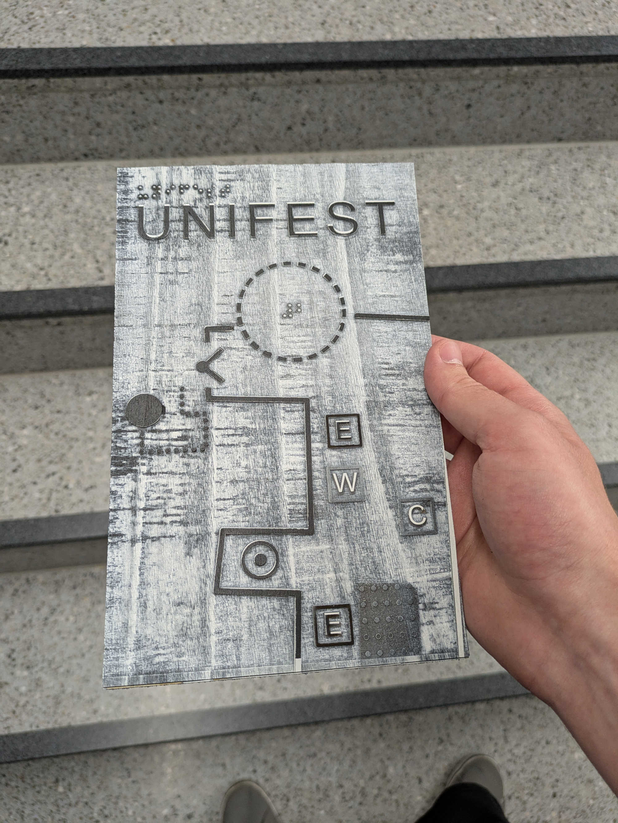
I then coated the raised areas with white synthetic resin-based varnish. If you apply two thick coats, you get a slightly rounded, smooth surface that contrasts with the wood. (Unfortunately, one of the plans only had one coat, and the other could have done with a third). The panels are now finished.
Other people who have access to a more sophisticated woodworking shop (and enough experience not to cut their fingers on the saw) then built two tables for the panels. The wooden panels were then simply placed on these tables and pressed down with double-sided adhesive tape.
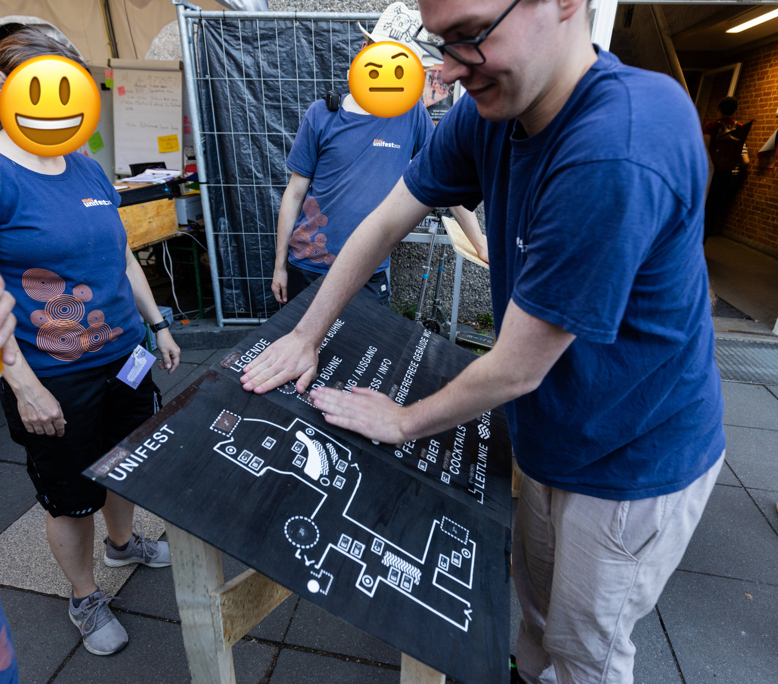 Photo: Khue Ngo (Instagram)
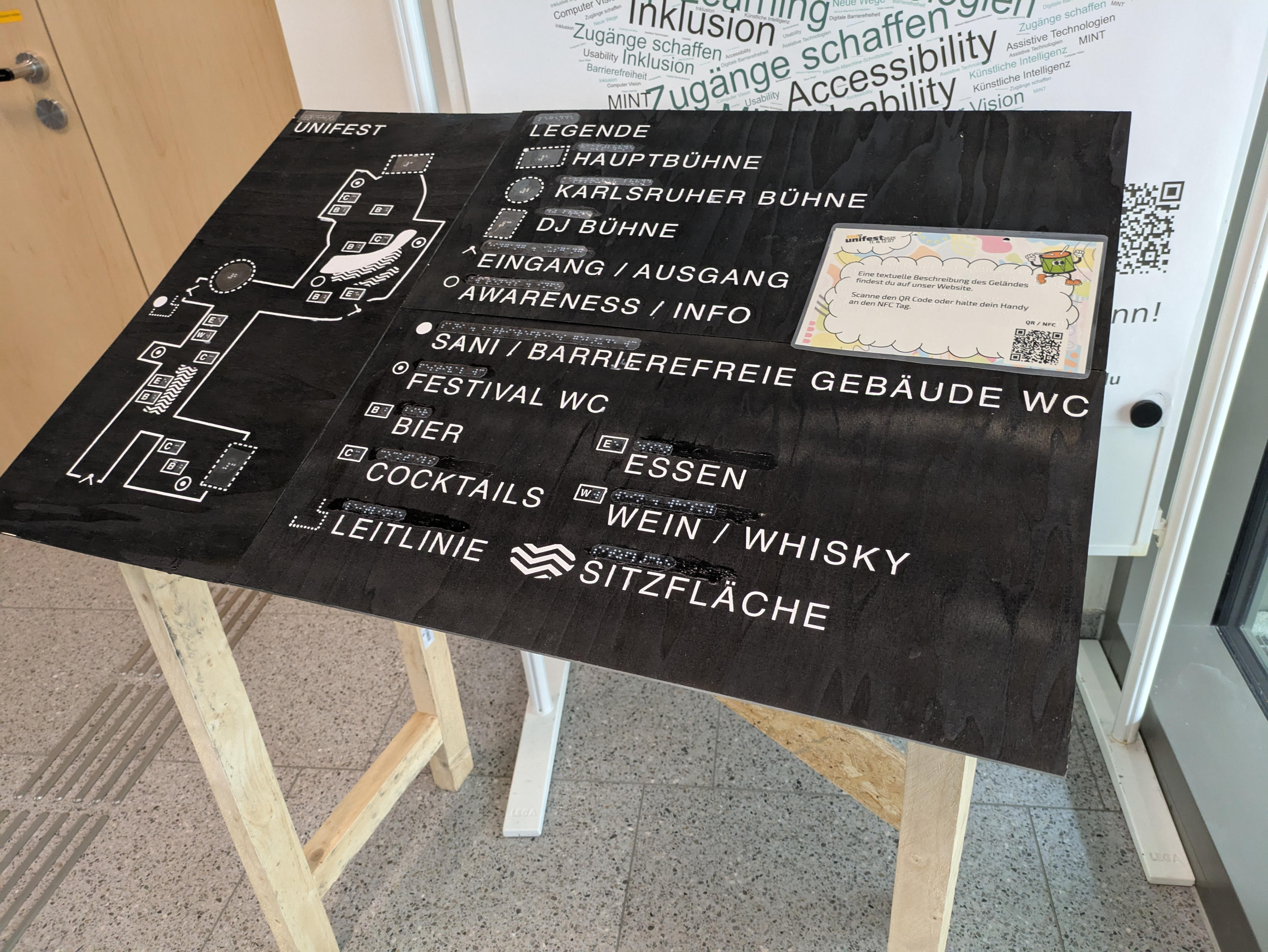
Finally, add a sign with a link to the textual plan. The whole thing has a QR code and an NFC sticker. Since the typewriter was already ready, I laminated the sign and quickly ran it through the typewriter.
The end result looks like this:
Conclusion
I find tactile maps interesting for some technical reasons and enjoyed trying them out for myself at Unifest.
The context in which tactile maps are useful is perhaps a little muddy. Users may have different personal preferences. Above all, some advantages and disadvantages vary depending on the individual and the intended use.
For example, there is the problem that maps have their own design concepts. My Unifest map, for example, with the representation of the stages or the grouping of food and drink POIs into small rectangles as a uniform design language. Even if this might be a good idea: You can only learn this logic when you are standing in front of the map and want to use it. In contrast: I can put a textual description on a website. That way, one at least has the chance to discover it before visiting and can explore the venue in advance.
Where such a tactile plan really has advantages is in conveying a more accurate spatial impression than textual descriptions alone. (Without substantiating this statement): This sounds like a sensible way of conveying the placement of tactile floor guidance systems. Such plans, containing this information might be helpful in spontaneous situations where the routing of a floor guidance system is not known in advance (or because the guidance system itself is new, because of a temporary event for example).
The problem of having to learn the concepts or legend elements of a tactile map does not arise in one variant. If we design not just one map, but several according adhering to the same concepts. Something like this exists for building information systems. When you enter a new building, you know immediately how the map is structured from previous buildings you have visited. You don’t have to find and understand a legend first and can, for example, immediately check how the floor guidance system to the elevator must be followed to find a seminar room or office. The TU Dresden, for example, is continously deploying such a combination of tactile maps and floor guidance systems (PDF page 15 / print page 28).
I would like to see more tactile maps.
-
Well, almost. Ignoring 2D Braille displays such as DotPad. ↩
-
My tactile map is, of course, also a work of art. Especially when it comes to not getting busted by campus security while making it. ↩
-
Please don’t hit me. ↩
-
The more I think about this plan from Kaufland, the more questions I have about its development, and assumptions that come up my mind. Unfortunately, I couldn’t find anything concrete about it, nor whether the Schwarz Group has built up its own expertise in this area. Mahhh… ↩
-
Compare Affordance Space, Definition 12 / Figure 7, Mirror ↩
-
Unfortunately, the round stage was not round at all. It was last year, and I looked at a plan that had not been updated. I only noticed this when the stage was set up with me standing in front of it. ↩